Volatility Clustering Method of Separating Distributions
Recently, I examined the concept of Volatility Clustering as a method to separate different distributions. When explained correctly, I believe this to be a relatively straightforward concept, especially with visual aides.
The situation: We are given a dataset of continuous inputs and outputs that, when plotted, look like this:

We quickly determine that there appear to be two different groups formed in this output. We will call them "steep" and "flat", further illustrated with the below visual aid:

Clearly, we have defined the "steep" group and the "flat" group as red and blue respectively. If we run a linear regression, we hope to split the difference as indicated below:
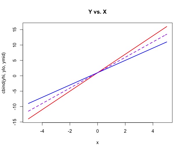
The next step in the methodology is to acknowledge that at any point along these distributions, the flat group will always remain closer to a flat y=0 line than the steeper option:

One option to separate these two groups is to identify that the flat group is larger than the linear regression line before the intersection of the two and the opposite after the intersection. This makes intuitive sense but unfortunately becomes clumsy around the intersection point because these are data points after all and not clean lines. Rather we recommend using the variability of the lines at each point, explaining the title "Volatility Clustering". If instead of plotting each individual point, we graph the variation of each point from the mean, that concept becomes more obvious:

Now we can see an even better separation between the groups because the "Steep" group's variation from the mean tends to be larger (because of the greater slope), and the opposite for the flat group. We will now tell our program that all data points whose variation from the mean is larger than the linear model's fitted value, will be assigned it to the "Steep" group, and if not, we assign to the "Flat" group automatically. Let's explore this concept with data points now.

The above is the same set of data points from the original image with a linear regression (red line) plotted as well. If we graph the squared deviations from the mean for each individual point, our graph looks similar to the previous parabola example.

On each end, we have a clear separation between the two groups, even more defined with the addition of our regression line's squared deviations from the mean across the respective points in red:

Now we can code our rule where we assign each individual point to either "Steep" or "Flat" based on its relationship to our regression line's squared deviation curve. If we use this framework and plot these two groups with different colors against the regression we get the following:

Now we can move this back to our original scatterplot of inputs and outputs and see that our separation appears accurate:

Now that we have these two groups separated not only visually but also in our newly defined data frame, we can continue our analysis. We can run linear models on each of the samples and again confirm our process.

I contend this is a pretty sleek way to separate groups based on variability. All data analysis and visualizations were completed in Rstudio. I am happy to share more detailed code to anyone interested. Thanks for reading.


Comments
Post a Comment